How to Choose the Right Paint Colors for Every Room (A Designer’s Method)
Paint color selection is one of those decisions that seems simple until you’re standing in a home improvement store holding three identical-looking chips of white, trying to decide which one is the right white, while the lighting makes all of them look equally acceptable. Then you get home, put a swatch on the wall, and realize the chip lied.
This guide gives you the framework professional interior designers use — the actual decision-making process, not just a list of trendy colors. Understanding how color selection works means you can confidently choose colors for any room, under any lighting conditions, without relying on guesswork or trend lists that’ll be outdated in eighteen months.
The Concept Nobody Explains: Undertones
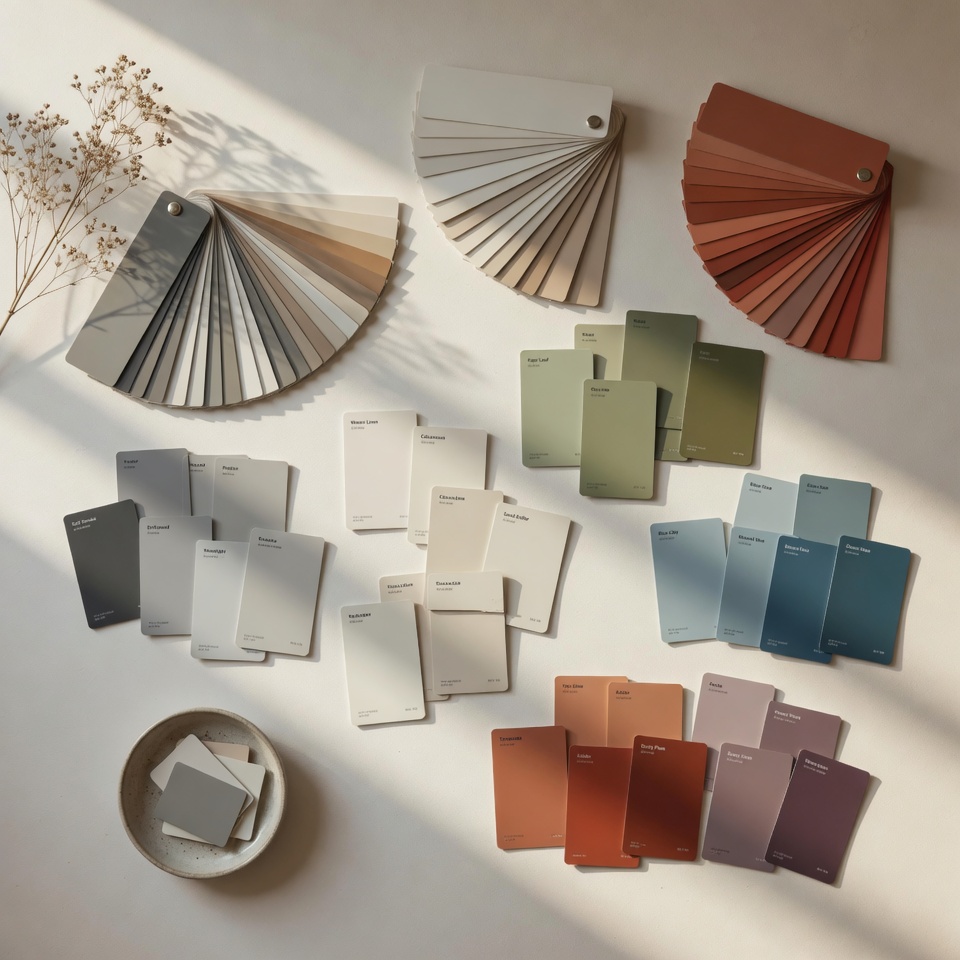
Every paint color has an undertone — a secondary hue that becomes visible when the color is on your walls. This is why the perfect white in the store looks slightly pink or yellow at home, or why the warm gray you chose has a purple quality in certain light.
Understanding undertones before choosing colors prevents the most common paint regrets.
Common undertones and what causes problems:
Whites: White is rarely neutral. Most whites pull warm (toward yellow, cream, or pink) or cool (toward blue or green). A white with yellow undertones next to bright white trim looks yellow. A white with pink undertones in a room with any natural wood reads muddy.
The reliable whites that tend to be truly neutral: Benjamin Moore Chantilly Lace (OC-65) and Sherwin-Williams Alabaster sit at opposite ends of the warm-cool spectrum but both behave consistently across lighting conditions. Pure White (Sherwin-Williams 7005) is the reliable neutral in the middle.
Grays: Gray undertones are notoriously deceptive. The most popular “greige” tones — gray-beige hybrids — often read as lavender or green in rooms with cool north light. Test in your actual space.
Greens: Currently the most requested interior color family in 2026. Sage greens with gray undertones are the most versatile (Benjamin Moore Pale Sage, Farrow & Ball Mizzle). Greens with yellow undertones work in spaces with warm artificial light but can appear sickly in rooms with cool daylight.
The Room-by-Room Method
Step 1: Identify your fixed elements first. Before looking at a single paint chip, catalogue the colors that won’t change: flooring, existing furniture, fireplace surround, built-ins, or any architectural feature. These fixed elements determine the undertone family your wall color needs to harmonize with.
Step 2: Determine your room’s light source. North-facing rooms: cool, bluish light all day. Colors need warmth to compensate — avoid cool grays and blues, lean toward warm neutrals and whites. South-facing rooms: warm, bright light. The most forgiving for color — almost anything works here. East-facing rooms: warm morning light, cool afternoon. Great for spaces used primarily in the morning. West-facing rooms: cool mornings, warm evenings. Consider how you primarily use the room.
Step 3: Sample correctly. Buy paint samples — the small jars available at paint counters, not the little paper chips. Paint a 12×12 inch patch directly on the wall in the actual room. Look at it at multiple times of day and under artificial evening lighting. This process costs $3–$6 per color and prevents the far more expensive and time-consuming mistake of painting a full room the wrong color.
Color Recommendations by Room
Living Room: The living room’s challenge is that it’s occupied at all times of day under different lighting conditions and usually contains the most varied mix of furniture and materials. This demands either a strong neutral that bridges everything or a committed color choice that anchors the entire room.
Strong performers: Agreeable Gray (SW 7029) for warm neutrals, Repose Gray (SW 7015) for cooler neutrals, Evergreen Fog (SW 9130) for a current sage green with staying power.
Bedroom: Bedrooms benefit from colors that lower cortisol and promote relaxation — blues, muted greens, and warm whites outperform cooler, stimulating colors in sleep research. Pale blues (Sea Salt by Sherwin-Williams remains enduringly popular), warm whites, and dusty sage greens are the most consistent performers.
Kitchen: Kitchens are active spaces with variable lighting and often contain strong fixed colors (cabinets, appliances, countertops). White and off-white remain the dominant choice because they maximize light and don’t compete with the kitchen’s inherent visual complexity. If you want a non-neutral kitchen, concentrate color on a single island or lower cabinets — using two colors (light uppers, darker lowers) is one of the most requested kitchen looks in 2026.
Bathroom: Small spaces concentrate color more than large ones — a color that reads as a soft accent in a bedroom reads as intense in a small bathroom. Lean lighter than you think you need to. White with warm undertones, pale blue-gray, and very soft sage green work reliably in bathrooms with limited natural light.
Home Office: Research on color and productivity favors medium-saturation blues and greens — enough color to feel stimulating, not so much as to be distracting. Navy and forest green accent walls behind monitors have become a staple of home office design precisely because they’re easy to look at for extended periods.
The Finish Question
Beyond color, paint finish affects both appearance and practicality:
Flat/matte: Hides imperfections well, not washable — living rooms, bedrooms, ceilings. Eggshell: Slight sheen, slightly more washable — the standard finish for most interior walls. Satin: More sheen, washable — kitchens, bathrooms, hallways, any high-traffic area. Semi-gloss: Reflective, very washable — trim, doors, cabinets. High-gloss: Highly reflective, very washable — accent furniture, trim in traditional spaces.
The mistake: using flat paint in kitchens and bathrooms. It absorbs moisture, harbors mildew, and can’t be cleaned without removing the paint. Always use satin or semi-gloss in wet areas.
The One-Color-Family Method (For Easier Decisions)
If color selection feels overwhelming, the one-color-family method simplifies the decision: choose one undertone family for your entire home’s main spaces (all warm neutrals, or all cool-white-based neutrals) and vary only the depth and saturation from room to room.
A home where every room uses a color within the same undertone family — even with different hues — feels intentionally designed and flows naturally from space to space. A home where each room is a completely independent color decision often feels disjointed and small.
Related: [10 Weekend DIY Projects That Add Real Value to Your Home] — apply fresh paint as part of a complete weekend renovation.